Splunk Dashboards for Sporting Goods Store
Splunk, SPL, Dashboards, Data Analytics, SIEM tools
Contents
- Scenario
- Objectives
- Results
- 📄 Task 1: Create a timechart showing actions made by shoppers each day
- 📄 Task 2: Create a pie chart showing the total number of each action made by shoppers
- 📄 Task 3: Create a single value visualization that represents the total purchases made
- 📄 Task 4: Create a column chart showing the types of items customers purchased
- Resulting dashboard
Scenario
In this project, I’ll be creating a Splunk dashboard for a Sporting Goods store. The dashboard will have visualizations that detail the types of actions shoppers are taking in the store (purchasing, viewing items, adding to cart) and information about items purchased over a one week period. I will be using mock data that I’ve added to Splunk.
Objectives
Create a dashboard with the following visualizations:
- A column chart showing actions made by shoppers each day
- A pie chart showing the total number of each action made by shoppers
- A single value that represents the total purchases made
- A column chart showing the types of items customers ordered for each web server (web1, web2)
Results
📄 Task 1: Create a timechart showing actions made by shoppers each day
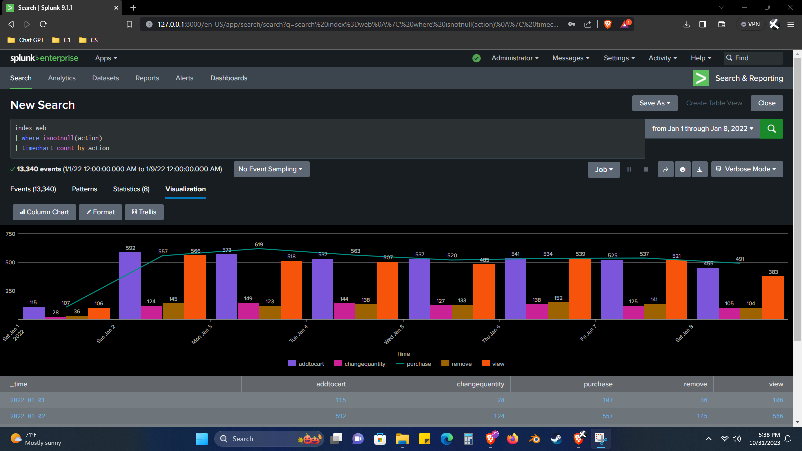
Step 1: In the SPL bar, I use the following command:
index=web
| where isnotnull(action)
| timechart count by action
index=webtells Splunk to retrieve data from the “web” index.
| where isnotnull(action)filters the results to only include events where the “action” field is not null.
| timechart count by actionperforms a timechart visualization. Splunk will count the events for each distinct value of the “action” field over time. The results will be presented in a timechart, with time on the x-axis and the count of events on the y-axis.
I use the column chart format and I use a line graph of the total number of purchases as an overlay.
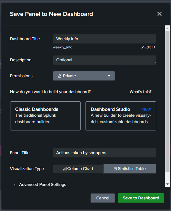
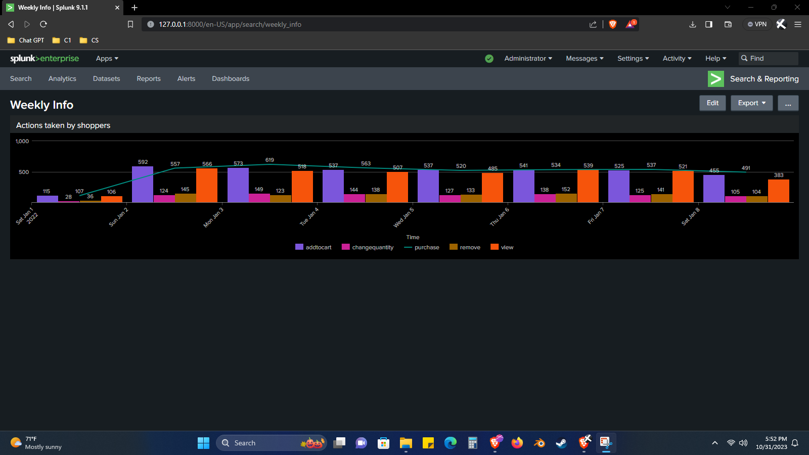
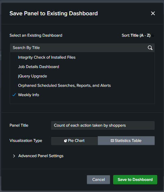
Step 2: I create a new dashboard and add the timechart from step 1. The dashboard title is “Weekly Info” and the panel is called “Actions taken by shoppers”.
New dashboard:
📄 Task 2: Create a pie chart showing the total number of each action made by shoppers
Step 1: In the SPL bar, I use the following command:
index=web
| stats count by action
| stats count by actionwill output a table that counts the number of events for each value of the action field.
I choose to display the results as a pie chart.
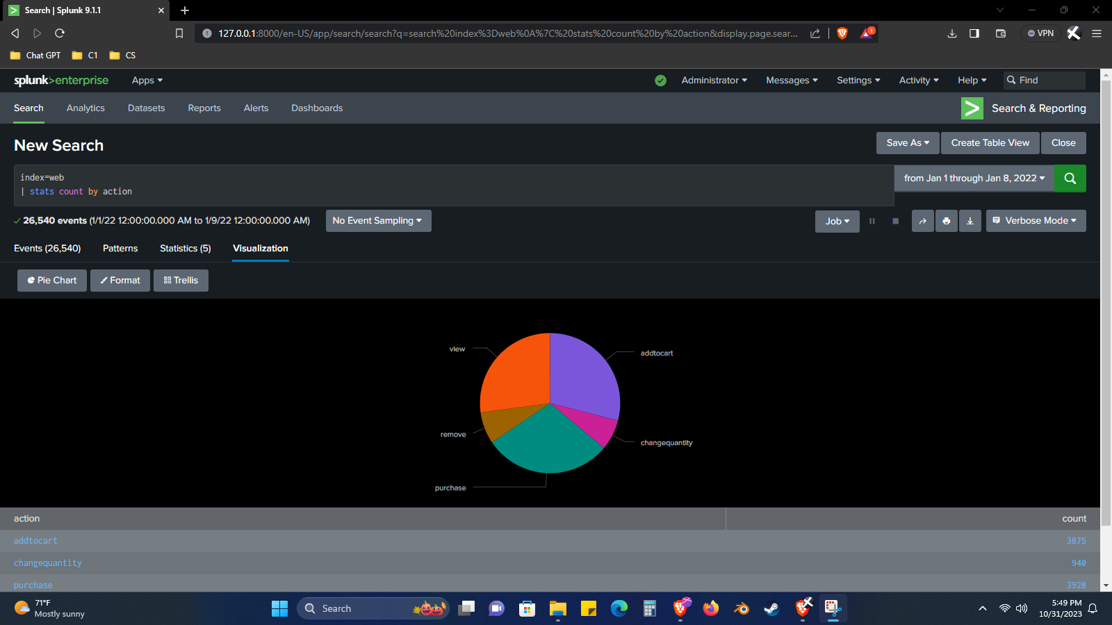
Step 2: I add this pie chart visualization to the existing Weekly Info dashboard.
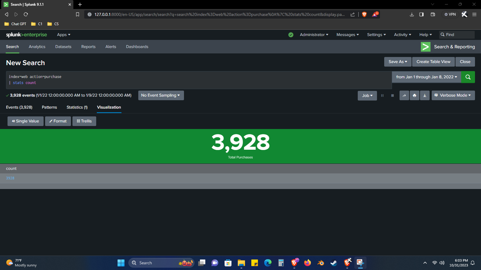
📄 Task 3: Create a single value visualization that represents the total purchases made
Step 1: I use the following command:
index=web action=purchase
| stats count
index=web action=purchasenarrows down the search to only include events where a purchase action was recorded.
| stats counttells Splunk to count the number of purchase events.
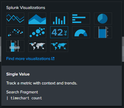
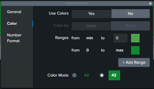
I choose the single value visualization:
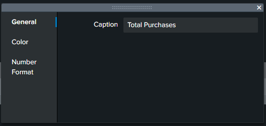
I add a caption:
Lastly, I change its background to green to help it stand out in the dashboard:
Final result:
📄 Task 4: Create a column chart showing the types of items customers purchased
Step 1: In the SPL bar, I use the following command:
index=web action=purchase
| lookup productinfo.csv productId OUTPUT description
| where isnotnull(productId)
| chart count over host by description
| lookup productinfo.csv productId OUTPUT descriptionlooks up information from a CSV file named “productinfo.csv” to return item descriptions based on the “productId” field.
| where isnotnull(productId)tells Splunk to only return events where the “productId” field is not null.
| chart count over host by descriptioncreates a chart. Splunk will count the number of events for each unique combination of “host” and “description.” The values of the “host” field (web1, web2) will be on the x-axis, and the values of the “description” field will be on the y-axis.
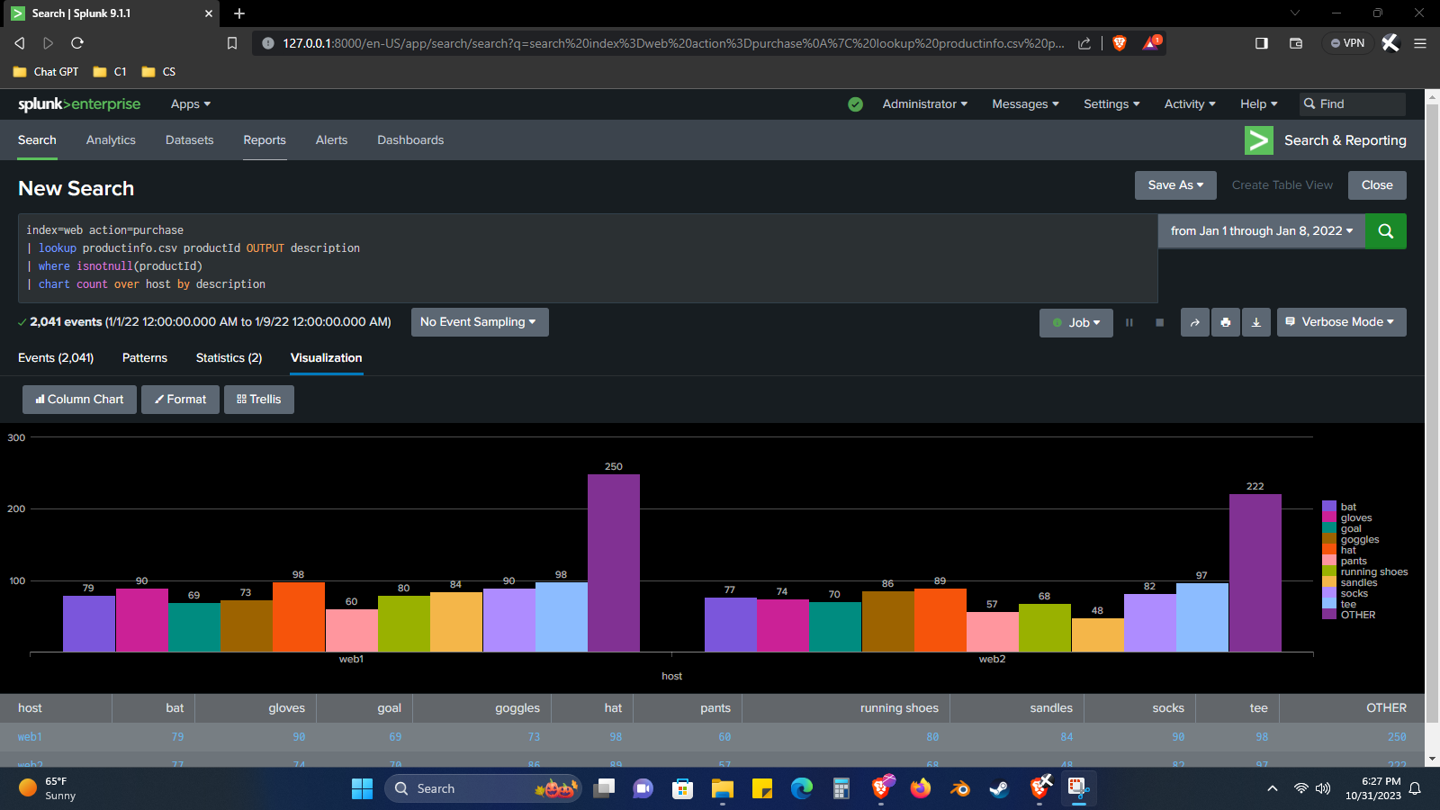
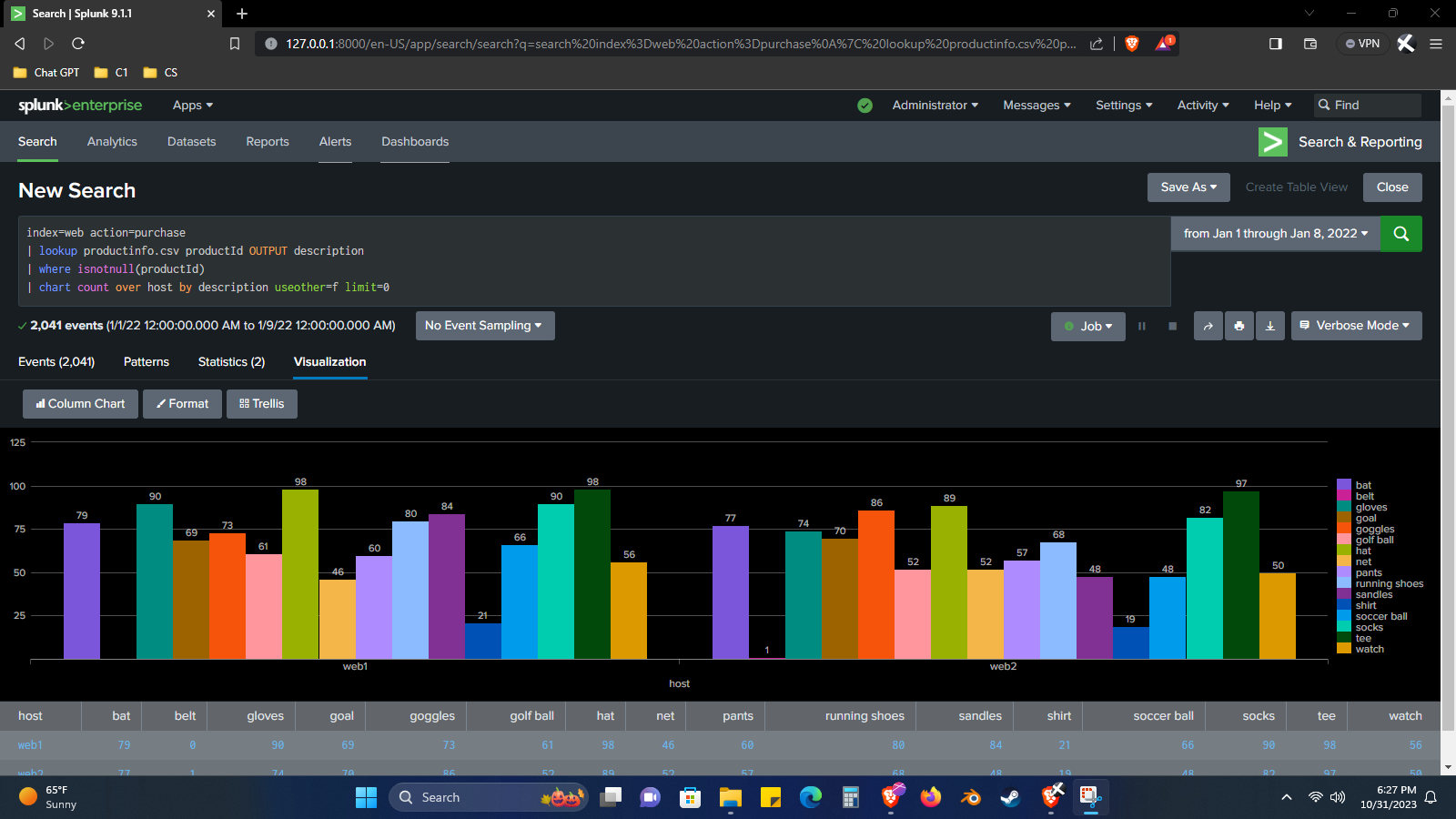
Step 2: To make the chart more detailed, I need to remove the “OTHER” category from the chart (the tall purple bars). By default, Splunk will only show the top 10 item descriptions, so I need to include an argument that tells Splunk to show data for all item descriptions, not just the top 10.
I do this by adding the following arguments:
useother=f limit=0
useother=ftells Splunk not to use the OTHER category and removes it from the chart.
limit=0tells Splunk not to set a limit on the number of item descriptions shown in the chart
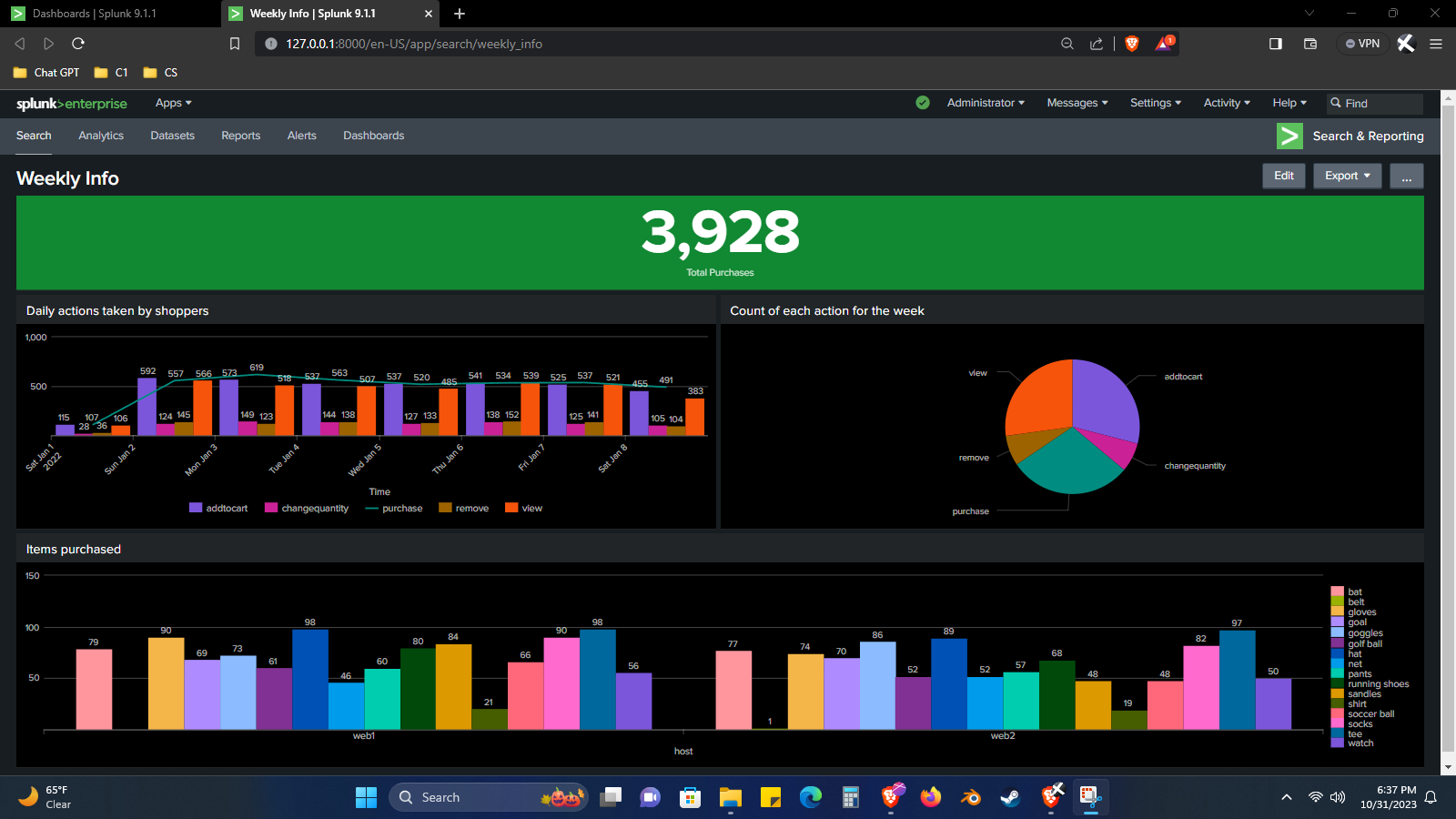
Resulting dashboard
After all the visualizations have been added to the Weekly Info dashboard, it looks like this: